
Tooth & Nail Studio
2025
Brand Identity
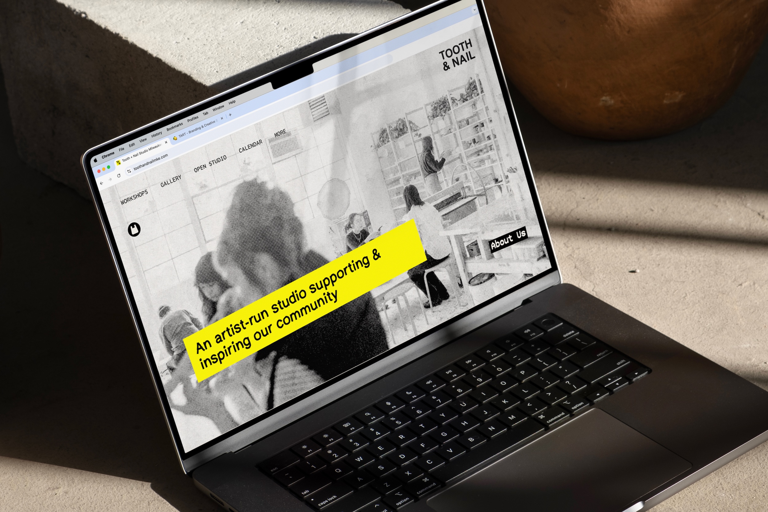
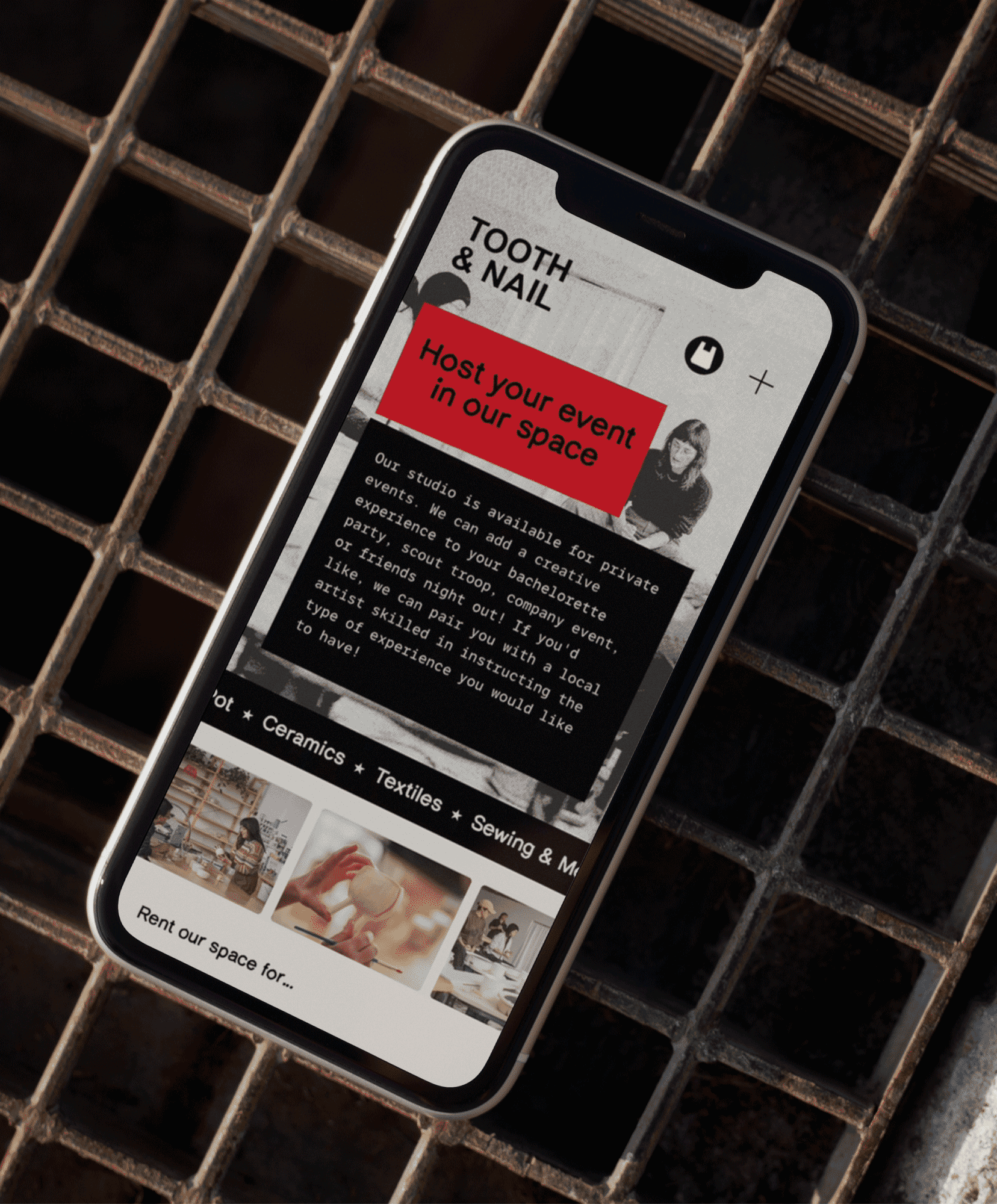
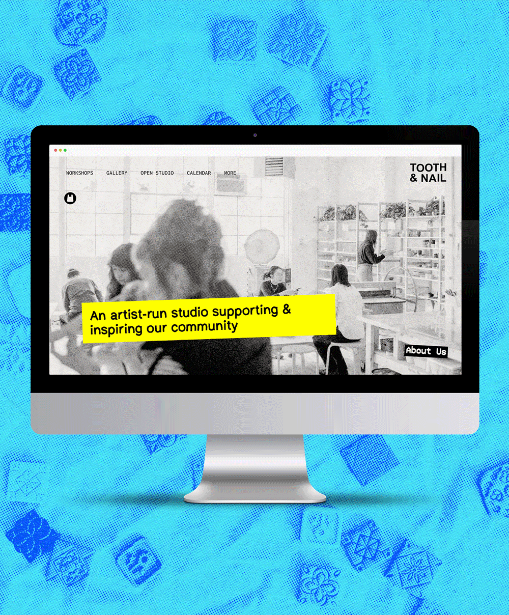
Website
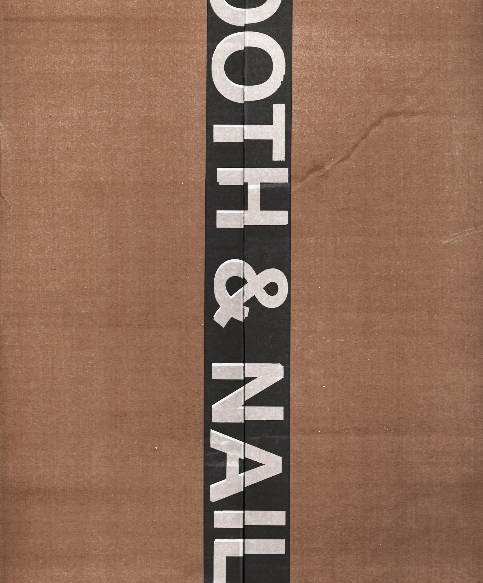
Swag Design
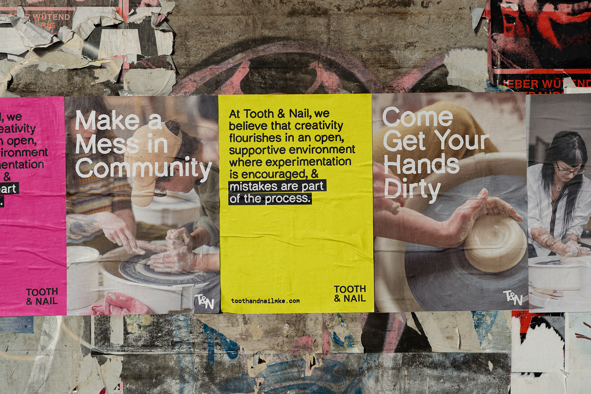
Campaign Concepts
Website
Swag Design
Campaign Concepts
Tooth & Nail was built by and for artists—messy, curious, and proudly offbeat. It’s a space where anti-capitalist values meet creative freedom, where people are invited to get a little dirty, try something new, and feel genuinely welcome doing it. The brand needed to reflect all of that: a permission-giving, punk-adjacent space that’s nurturing and knowing.
We started by mapping the mission: a queer-centered ceramics studio that’s equal parts art space and container for connection. Through our brand questionnaire and a one-on-one visioning session, we surfaced the values and tensions that define the space: structure and experimentation, edge and softness, professionalism and punk.
The creative direction leaned into expressive imperfection, drawing from zine culture, scanner-bed collages, punk buttons, and Letraset typography. We wanted it to feel tactile and a little chaotic. The logo is set in Arial—a nod to accessibility and DIY spirit—and the mix-and-match type system and distressed textures speak to flexibility and experimentation.
We expanded the visual language into a flexible brand identity that can shapeshift with the space—layered, handmade, and rooted in community energy. Designed to adapt as new artists rotate in, new workshops pop up, and the vision evolves.
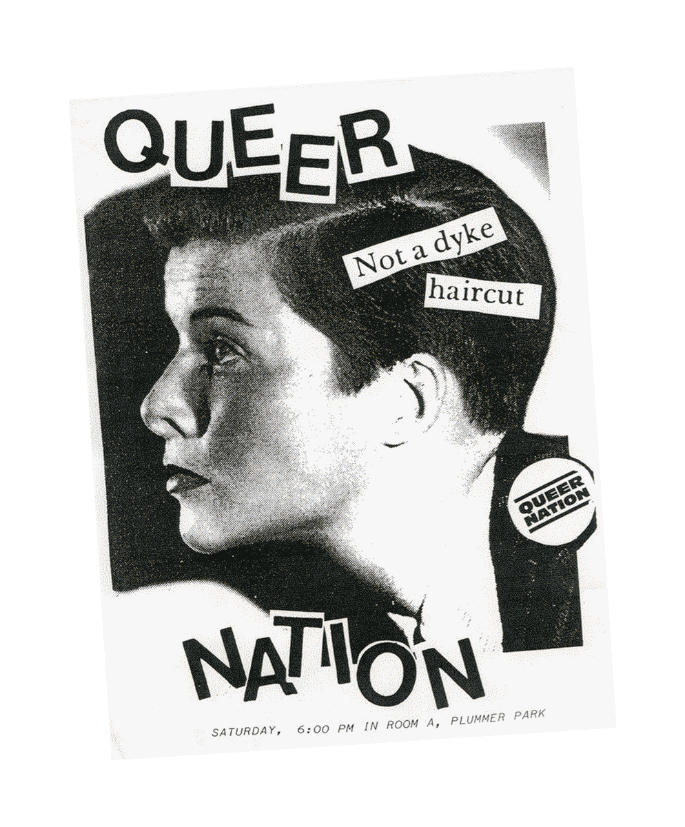
↑ A few of our archival references


“The work [with TART] furthered Tooth + Nail's mission. We are now able to reach new audiences with a clearer, more beautiful articulation of what we offer and who we are... I felt fully supported throughout the process—and the result feels exactly like us.”
— Janelle, founder of Tooth & Nail
— Janelle, founder of Tooth & Nail
⊹₊⟡⋆
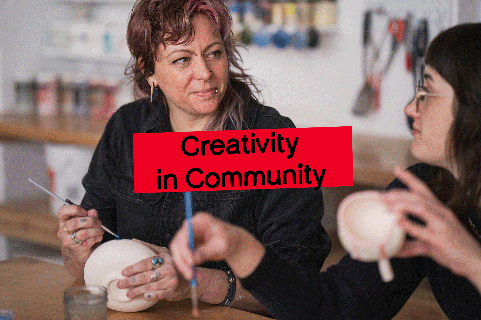
Photography by Kat Schleicher
1
2
3
4
5
6
2
3
4
5
6
7
8
9
10
11
12
8
9
10
11
12
Tooth & Nail *fresh*
Julia Gartland
Little Miss Sun Sign
Nivi Shaham
Anyhow Studio
Vital CxNs *coming soon*
Julia Gartland
Little Miss Sun Sign
Nivi Shaham
Anyhow Studio
Vital CxNs *coming soon*